This is the first of 3 blog posts about my Summer 2015 SeePilgrims interactive installation at a friend’s festival.
Part 1 covers the motive and the result – what actually is it?
Part 2 describes the components, technicalities and the design process I went through.
Part 3 describes the experience of starting, finishing and exhibiting a project, my first since starting this journey of learning technology.
PART 1: SeePilgrims came out of the desire to contribute to a friend’s private mini-festival, and to give a focus to some of the skills I have been learning on my University of Dave journey.
I started with two possible possible project ideas: a Node.JS based, mobile-controlled art installation, and a Kinect based movement/shape installation). I did around 30 hours of development of each to get them from concept to soemthing vaguely workable. The winner was SeePilgrims – the Kinect based visuals. This was mainly because it would be the easiest to run in the festival environment, based in a barn with a projector and allowing more casual interactions, and without any priming needed for the participants.
So SeePilgrims received another 50 hours or so of development effort, which also included building a screen, a jig for the Kinect, and rigging for this and the projector in the barn.
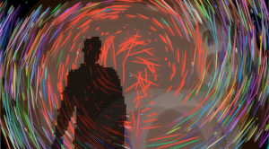
The result is a loop around twelve visual themes, driven my the detected human shapes, each running for around 20-40 seconds. The themes picked up some output from the Kinect in realtime, and perform some post-processing with the image or depth data to create some visual confections that would work best with folks dancing in front of it to some loud beats. I added a few background effects and some beat detections to help with this. It added up to a kind of 80’s/90’s music video effect. More fun than art, but it seemed to go down well.
So, being setup in the barn, over an amazingly sunny weekend, it did not receive the attention it might have done, but as I had left it running, someone would walk past and notice a swirly, colourful impression of their own body and movements. They would stop and play with this, then call in a friend, or their children and you soon had people dancing and playing with the experience. I kept the themes changing to keep the experience fresh for the viewer. Even though the loop eventually comes back to the same theme, the audience are likely to get a different experience as it all depends on who is in front of the Kinect and what they are doing.
For reasons explained in part 2, the rendering of the human outline is a little bit blocky and some themes really hammer the framerate due to the amount of processing performed with each grab of depth data, but in some ways this added to that whole 80’s throw-back music video effect, and it bothered me more than my audience.
I had three of the themes based on a Kaleidoscope effect, taking a simple RGB feed from the Kinect’s camera, which worked well in testing but in the barn was too dark, even in daylight. The depth based themes have no dependency on light, and we had a nice effect when a table tennis game in front of the setup rendered a perfect profile of the table with the ball leaving some nice vapour trails.
For a description and video snippet of each theme see Part 2, which focusses on the design and technical aspects of the project.


No comments yet.